5 Results
5.1 Summary of the data
| Summary table | ||||
|---|---|---|---|---|
| Complexity metrics of prostate VMAT plans | ||||
| Characteristic | Field Size | p-value2 | ||
| PO, N = 341 | PSV, N = 781 | WPRT, N = 1051 | ||
| CoA (1/mm) | 0.38 (0.05) | 0.38 (0.10) | 0.46 (0.06) | <0.001 |
| EM (1/mm) | 0.268 (0.011) | 0.267 (0.010) | 0.266 (0.009) | 0.038 |
| ESF (mm) | 26 (6) | 32 (10) | 53 (8) | <0.001 |
| LT | 0.82 (0.06) | 0.77 (0.08) | 0.61 (0.10) | <0.001 |
| LTMCSV | 0.20 (0.05) | 0.16 (0.04) | 0.12 (0.03) | <0.001 |
| MCS | 0.234 (0.046) | 0.218 (0.029) | 0.206 (0.027) | <0.001 |
| MCSV | 0.234 (0.046) | 0.217 (0.029) | 0.205 (0.026) | <0.001 |
| MFA (mm²) | 2,278 (830) | 2,766 (1,299) | 5,962 (1,100) | <0.001 |
| PI | 23 (4) | 26 (10) | 49 (8) | <0.001 |
| SAS (5mm) | 0.21 (0.10) | 0.21 (0.08) | 0.15 (0.06) | <0.001 |
| PO: Prostate Only, PSV: Prostate plus Seminal Vesicles, WPRT: Whole Pelvis Radiation Therapy | ||||
|
1
Median (IQR)
2
Kruskal-Wallis rank sum test
|
||||
Fig. 5.1 shows the probability density function distributions, based on a smooth kernel density estimate, for the various complexity metrics. The data have been standardized by subtracting the mean and dividing by the standard deviation. There are some evident similarities, e.g., among the bimodal distributions of ESF, MFA and PI. Also, MCS and MCSV are practically identical. In the next section, these correlations are exploited through the principal component analysis to yield a strong dimensionality reduction.
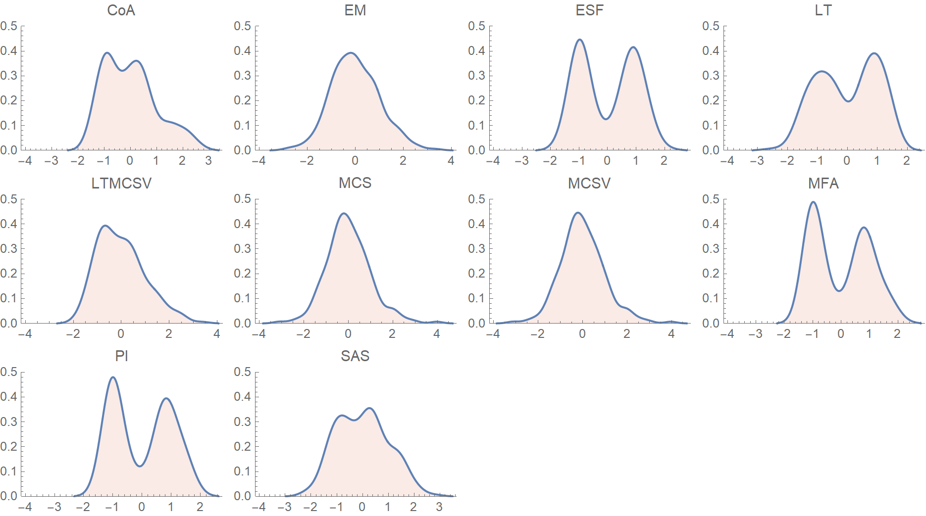
Figure 5.1: Probability density function distributions for the various complexity metrics. The data have been normalized by subtracting the mean and dividing by the standard deviation.
In Table ?? the candidate predictor variables are summarized, broken down by the field’s size. Whole pelvis radiation plans usually consist of two arcs, contrary to limited portals delivered with single arc plans. The dataset was unbalanced in terms of the treating physician, because PCa patients are treated mainly by the two senior physicians in our department. Rectum’s \(V_{50}\) was larger in WPRT as opposed to PSV or PO plans. By irradiating the pelvic lymph nodes, a larger part of the rectum inevitably receives at least 50 Gy.6 However, higher doses of radiation conform tightly to the prostate, which explains why rectum’s \(V_{70}\) does not differ significantly between groups.
| Summary table | ||||
|---|---|---|---|---|
| Candidate predictor variables | ||||
| Characteristic | Field Size | p-value2 | ||
| PO, N = 341 | PSV, N = 781 | WPRT, N = 1051 | ||
| Number of arcs | <0.001 | |||
| 1 | 28 / 34 (82%) | 47 / 78 (60%) | 15 / 105 (14%) | |
| 2 | 6 / 34 (18%) | 31 / 78 (40%) | 90 / 105 (86%) | |
| Total MUs | 617 (69) | 614 (72) | 606 (36) | 0.057 |
| Physician | <0.001 | |||
| Phys1 | 3 / 34 (8.8%) | 1 / 78 (1.3%) | 6 / 105 (5.7%) | |
| Phys2 | 17 / 34 (50%) | 51 / 78 (65%) | 34 / 105 (32%) | |
| Phys3 | 2 / 34 (5.9%) | 2 / 78 (2.6%) | 8 / 105 (7.6%) | |
| Phys4 | 3 / 34 (8.8%) | 0 / 78 (0%) | 2 / 105 (1.9%) | |
| Phys5 | 3 / 34 (8.8%) | 1 / 78 (1.3%) | 11 / 105 (10%) | |
| Phys6 | 1 / 34 (2.9%) | 5 / 78 (6.4%) | 5 / 105 (4.8%) | |
| Phys7 | 5 / 34 (15%) | 18 / 78 (23%) | 39 / 105 (37%) | |
| Dosimetrist | 0.075 | |||
| Dos1 | 14 / 34 (41%) | 42 / 78 (54%) | 66 / 105 (63%) | |
| Dos2 | 20 / 34 (59%) | 36 / 78 (46%) | 39 / 105 (37%) | |
| TPS Version | 0.2 | |||
| 11.0.47 | 8 / 34 (24%) | 22 / 78 (28%) | 39 / 105 (37%) | |
| 15.1.52 | 26 / 34 (76%) | 56 / 78 (72%) | 66 / 105 (63%) | |
| Conformation Number | 0.87 (0.04) | 0.87 (0.05) | 0.87 (0.06) | 0.7 |
| PTV 72 Gy | 119 (72) | 102 (42) | 93 (37) | 0.048 |
| Bladder V65 | 8 (10) | 8 (9) | 8 (9) | 0.6 |
| Bladder V70 | 6.4 (7.8) | 5.4 (6.9) | 5.0 (7.2) | 0.4 |
| Rectum V50 | 21 (10) | 22 (10) | 24 (8) | 0.005 |
| Rectum V60 | 9.2 (5.7) | 9.1 (5.9) | 10.4 (5.1) | 0.3 |
| Rectum V70 | 2.90 (2.79) | 2.22 (3.41) | 2.92 (2.84) | 0.062 |
| PO: Prostate Only, PSV: Prostate plus Seminal Vesicles, WPRT: Whole Pelvis Radiation Therapy | ||||
|
1
n / N (%); Median (IQR)
2
Pearson's Chi-squared test; Kruskal-Wallis rank sum test; chi-square test of independence
|
||||
5.2 Principal Component Analysis
Principal component analysis is a widely used dimensionality reduction technique. Given a set of linearly correlated variables, PCA constructs new variables, called principal components, that are linear combinations of the original ones. The rationale is to reduce a larger set of variables into a smaller one, which accounts for most of the original dataset’s variance. Before applying PCA, we verified whether our data fulfilled some basic assumptions.
5.2.1 Correlation matrix
Table 5.1 shows the correlation matrix between different complexity indices, calculated with the Pearson method. Except for the CoA metric, all others had at least one such correlation that exceeded the above threshold. Therefore, CoA was excluded from further analysis.
| coa | em | esf | lt | ltmcsv | mcs | mcsv | mfa | pi | sas | |
|---|---|---|---|---|---|---|---|---|---|---|
| coa | 1.00 | 0.12 | 0.11 | 0.03 | 0.01 | -0.01 | -0.01 | 0.10 | 0.12 | -0.17 |
| em | 0.12 | 1.00 | -0.46 | 0.28 | 0.03 | -0.32 | -0.32 | -0.52 | -0.41 | 0.37 |
| esf | 0.11 | -0.46 | 1.00 | -0.94 | -0.74 | -0.19 | -0.19 | 0.98 | 0.99 | -0.58 |
| lt | 0.03 | 0.28 | -0.94 | 1.00 | 0.85 | 0.31 | 0.31 | -0.89 | -0.94 | 0.52 |
| ltmcsv | 0.01 | 0.03 | -0.74 | 0.85 | 1.00 | 0.76 | 0.76 | -0.64 | -0.73 | 0.13 |
| mcs | -0.01 | -0.32 | -0.19 | 0.31 | 0.76 | 1.00 | 1.00 | -0.04 | -0.16 | -0.41 |
| mcsv | -0.01 | -0.32 | -0.19 | 0.31 | 0.76 | 1.00 | 1.00 | -0.04 | -0.16 | -0.41 |
| mfa | 0.10 | -0.52 | 0.98 | -0.89 | -0.64 | -0.04 | -0.04 | 1.00 | 0.99 | -0.64 |
| pi | 0.12 | -0.41 | 0.99 | -0.94 | -0.73 | -0.16 | -0.16 | 0.99 | 1.00 | -0.61 |
| sas | -0.17 | 0.37 | -0.58 | 0.52 | 0.13 | -0.41 | -0.41 | -0.64 | -0.61 | 1.00 |
The reason why CoA lacks a significant correlation with the rest of the indices is obviated by looking at the plot of CoA vs. LT in Fig. 5.2. By breaking up the data based on the VMAT plan’s field size and the number of arcs, two distinct clusters of VMAT plans are emerging. The first one consists mostly of WPRT plans with two arcs, for which the two indices show a strong linear correlation. The second cluster is characterized by small CoA values and large LT, consisting of mostly small field plans delivered via one arc. Similar results may be obtained by comparing CoA vs. PI, EM, and the rest of the indices.
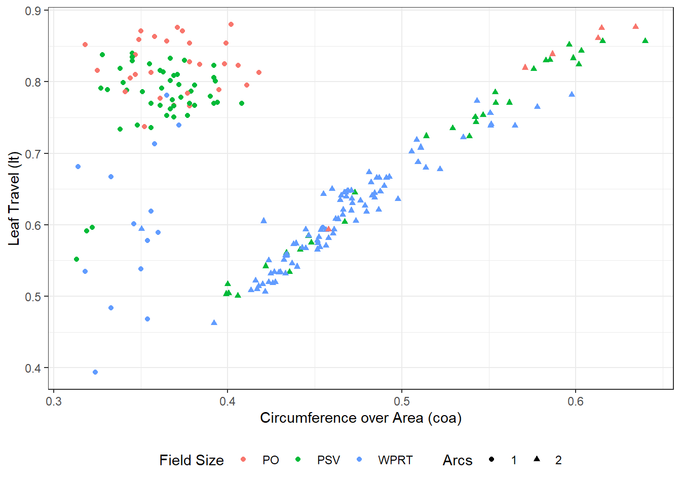
Figure 5.2: CoA vs. LT, broken down by field size and number of beams (arcs) per plan. The data form two clusters, depending on the number of arcs.
Fig. 5.3 shows the correlations of Table 5.1 visualized in a matrix plot. The squares’ color is proportional to the Pearson correlation coefficient of the respective pair of CMs. The matrix is symmetric since correlation is commutative, i.e. \(Corr(x,y) = Corr(y,x)\).
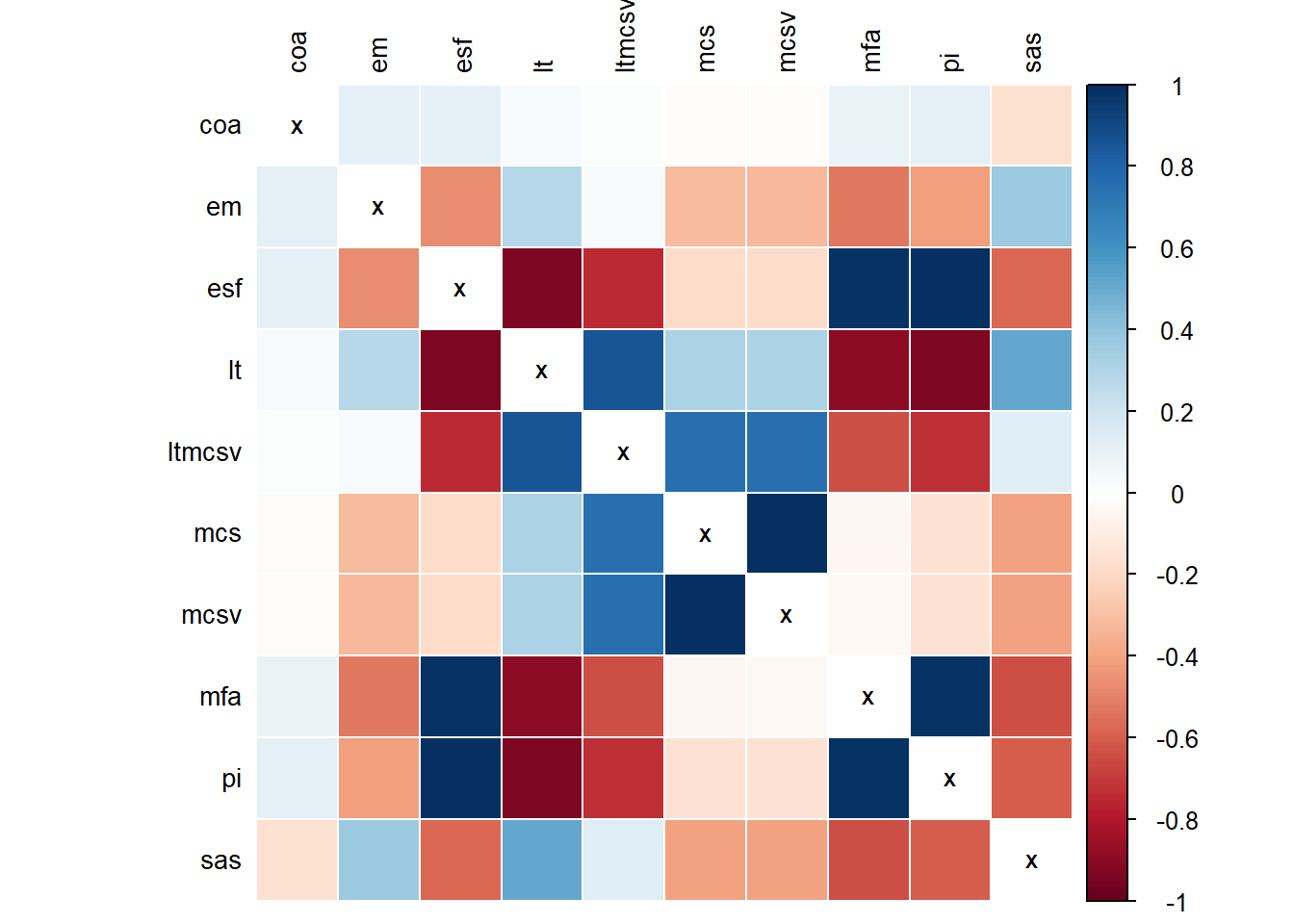
Figure 5.3: Correlation plot of complexity metrics. The threshold for including a variable into PCA was \(r \ge 0.3\).
5.2.2 Sampling adequacy
The Kaiser-Meyer-Olkin Measure of Sampling Adequacy indicates the proportion of variance in a dataset that could be caused by underlying factors. High values of KMO (close to 1.0) generally indicate that an explanatory factor analysis may be useful. The MSA values of each individual complexity metric in our dataset were the following:
Historically, Kaiser and Rice,43,47 suggested as a rule of thumb that MSA values less than 0.5 are unacceptable. The KMO value of EM was remarkably low, and removing it from the set of variables increased the overall KMO to 0.76. However, given the edge metric’s importance, we opted to include it in the PCA, resulting in an overall KMO value of 0.66. However, Bartlett’s test of sphericity, with edge metric included, produced strong evidence in favor of the existence of adequate correlations in our dataset \((p < 0.0001)\). Considering the correlation matrix, the overall KMO criterion, and Bartlett’s test of sphericity, we concluded that principal component analysis was justified.
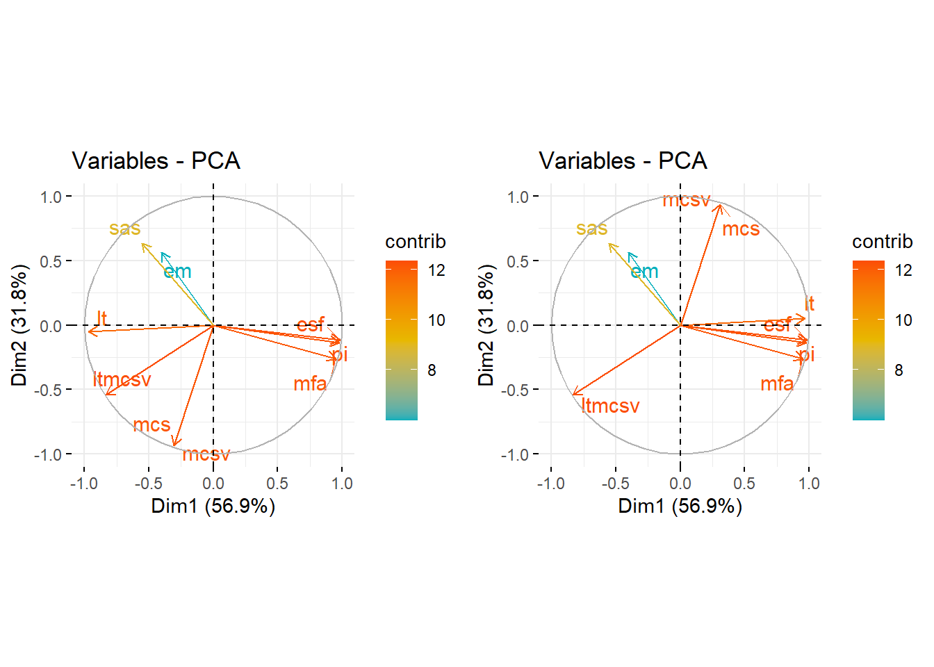
Figure 5.4: Loading plots of the principal component analysis. Left: Original dataset. Right: Transformed dataset so that LT, MCS, and MCSV increase in the same direction as the rest of the complexity indices, i.e., higher index value corresponds to higher plan complexity.
5.2.3 Loading plot
Fig. 5.4 shows two loading plots7 of the principal components analysis. In the left figure, we observe that the various complexity metrics fall into three coarse groups. The first group consists of ESF, MFA, and PI. The second group consists of EM and SAS. The last group loosely consists of MCS and MCSV, along with LT and LTMCSV. However, we keep in mind that LT, MCS, MCSV increase as plan complexity decreases. If we flip their sign for the sole purpose of comparison so that they increase in the same direction as the rest of the complexity indices, i.e., higher index value corresponds to higher plan complexity, we get the figure at the right. Now it becomes evident that LT, too, is positively correlated with ESF, MFA, and PI.
In Fig. 5.5, the smooth density histograms of the first cluster are shown, broken down by the number of arcs. All these indices exhibit a bimodal distribution that heavily depends on the number of arcs. However, in our opinion, an ideal complexity metric should be “arc agnostic” in the sense that its value should not be influenced much by the number of arcs consisting a plan. This fact, along with some other arguments that we discuss later in the linear regression analysis section, contributed to our decision to choose LTMCSV for further analysis.
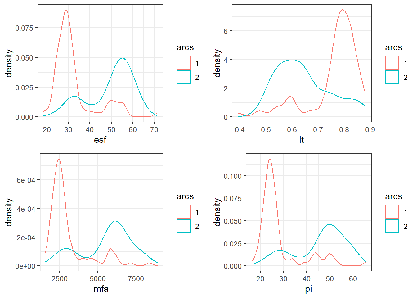
Figure 5.5: Smooth density histograms for ESF, LT, MFA, and PI. The histograms follow a bimodal distribution driven by the number of arcs.
Returning to the PCA loading plot, we also notice that the edge metric contributes less to the first two principal components compared to the rest of the indices. This further supports the hypothesis that EM measures some fundamentally different complexity property of the plans, as was implied by the particularly low value of KMO for EM. Next, we will describe the extraction of principal components, and there we will see how EM requires three PCs for its variance to be explained.
5.2.4 Principal components extraction
5.2.4.1 Eigenvalue criterion
The eigenvalue-one criterion48 is one of the most popular methods for deciding how many components to retain in the principal component analysis. An eigenvalue less than one indicates that the component explains less variance than a variable would and, therefore, should be omitted. The eigenvalue-one criterion implies that in our case, the first two principal components should be extracted.
5.2.4.2 Scree plot
In Fig. 5.6 the explained variance is plotted against the number of principal components. The inflection point of the scree plot is realized at \(N=3\). The cumulative explained variance of the data, with 3 PCs, is 96.2%.
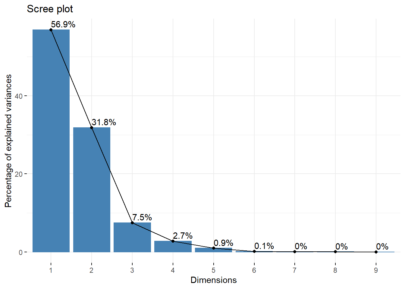
Figure 5.6: Scree plot of principal components. The inflection point is located at N=3 dimensions. With the use of 3 principal components the total variance of the data that can be accounted for is 96.2%.
5.2.5 Communalities
Communality is the proportion of each variable’s variance accounted for by the principal components. For the \(i_\text{th}\) variable, its communality is computed by taking the sum of the squared loadings up to \(m\) principal components, i.e. \(\hat{h}_i^2=\sum_{j=1}^m \hat{\varphi}_{ij}^2\). In the following table we list the communalities of the various complexity indices, by keeping 2 principal components:
And, by keeping 3 principal components:
Yet again, the edge metric manifests an outlier behavior. Although most of the indices’ variances are explained by the first two principal components, only 48% of EM’s is accounted for. Instead, to explain the majority of EM’s variance, three PCs are required. SAS shows a similar behavior, albeit to a lesser degree, with 2 PCs explaining 70%, and 3 PCs 86% of its variance.
5.3 Mutual Information Analysis
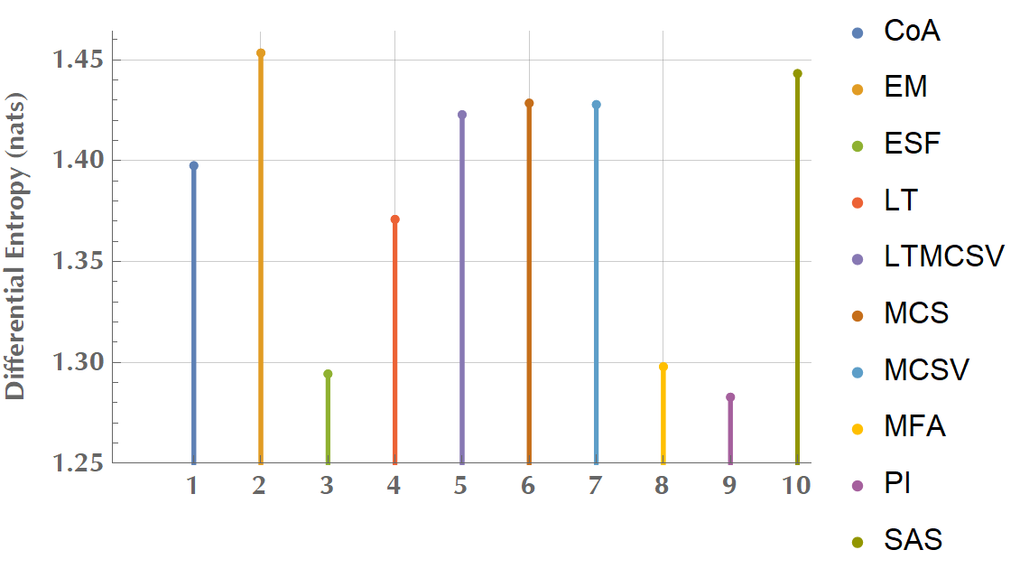
Figure 5.7: Differential entropy (in nats) of complexity metrics.
We calculated the differential entropy for all metrics (Fig. 5.7). For a continuous distribution with known mean, \(\mu\), and known variance, \(\sigma^2\), it can be proven that the maximum entropy distribution is the normal distribution.49 The value of the maximum entropy is \(\frac{1}{2} \left(1 + \ln\left(2 \pi \sigma^2\right)\right)\). Assuming standardized data, as in our case, i.e. \(\sigma = 1\), it is \(h(X) \simeq 1.42\), however in Fig. 5.7, there are variables exceeding this theoretical upper limit. We hypothesize that this is an issue of numerical integration. The important to note, though, is the relative informational content between different complexity metrics. For instance, ESF, MFA, and PI bear a particularly low one, relative to EM, LTMCSV, or SAS.
We calculated the mutual information for every pair of complexity metrics and sorted the probability density distributions by their MI value. Unlike the correlation coefficient, mutual information is more general and captures how much the pair’s joint distribution differs. In Fig. 5.8, we compare the MI of two pairs. The first pair is ESF and MFA with high MI, as opposed to the second pair of LT and MCSV, which has low MI. The particularly low mutual information of LT and MCSV provides supporting evidence in favor of the construction of the multiplicative combination, LTMCSV. In Fig. 5.9 we list the joint probability density distributions for all the pairs, sorted by ascending MI. This ranking might prove very useful in the context of creating a new complexity metric. For instance, some promising pairs with high individual entropy, low mutual information, and a strong effect on both first two principal components include EM/SAS, LTMCSV/SAS, LT/MCSV, and EM/SAS, to name a few.
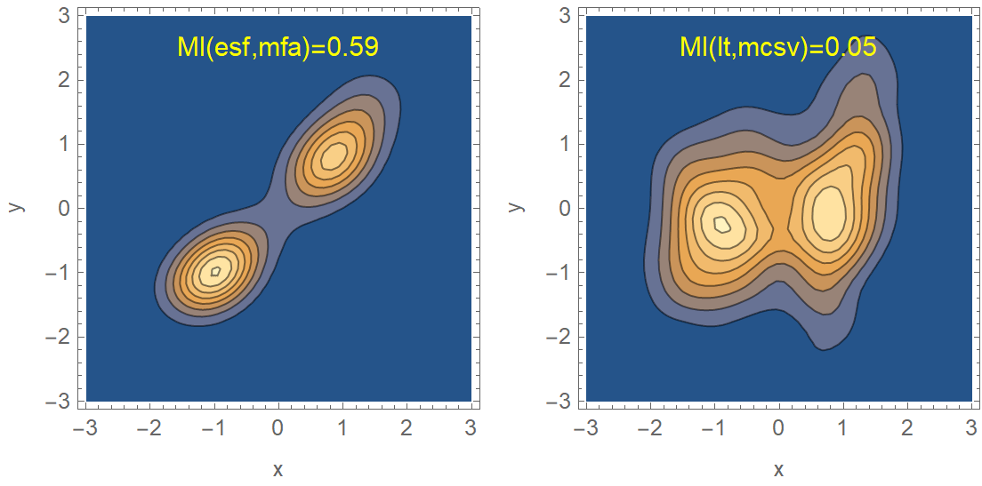
Figure 5.8: Contour plots of the joint distributions of two complexity metric pairs, along with their MI. The left pair (ESF, MFA) has almost 12 times higher MI compared to the right pair (LT, MCSV). The construction of a multiplicative combination of two complexity metrics should take into account their MI.
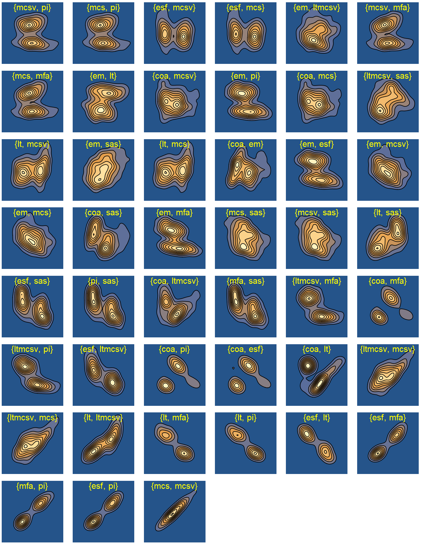
Figure 5.9: Contour plots of joint distributions of pairwise complexity metrics, sorted by ascending mutual information.
5.4 Linear Regression Analysis
The choice of a complexity metric that correlates well with one department’s quality assurance and verification indices has been an elusive goal. Masi et al. 31 found that LT, MCSV, and LTMCS were significantly correlated with VMAT dosimetric accuracy as expressed in gamma passing rates. In our PC analysis, LTMCSV was found to affect both the first and second principal components, presumably because it contains multidimensional information regarding a plan’s complexity. The pair LT and MCSV had low MI compared to other pairs, implying little redundance. Also, LTMCSV showed a distinct separation between plans with different field sizes, as we would expect for a well-founded complexity metric. Last, as we have already commented, it is “arcs agnostic”, in the sense that it is not heavily influenced by the number of arcs. For the reasons above, we chose LTMCSV as the complexity metric against which we developed our predictive models.
5.4.1 Multicollinearity detection
In the following scatter plot matrix of Fig. 5.10, we see that there are some variables in our dataset that are highly linearly correlated (\(r > 0.8\)), and a couple of others that are moderately correlated.
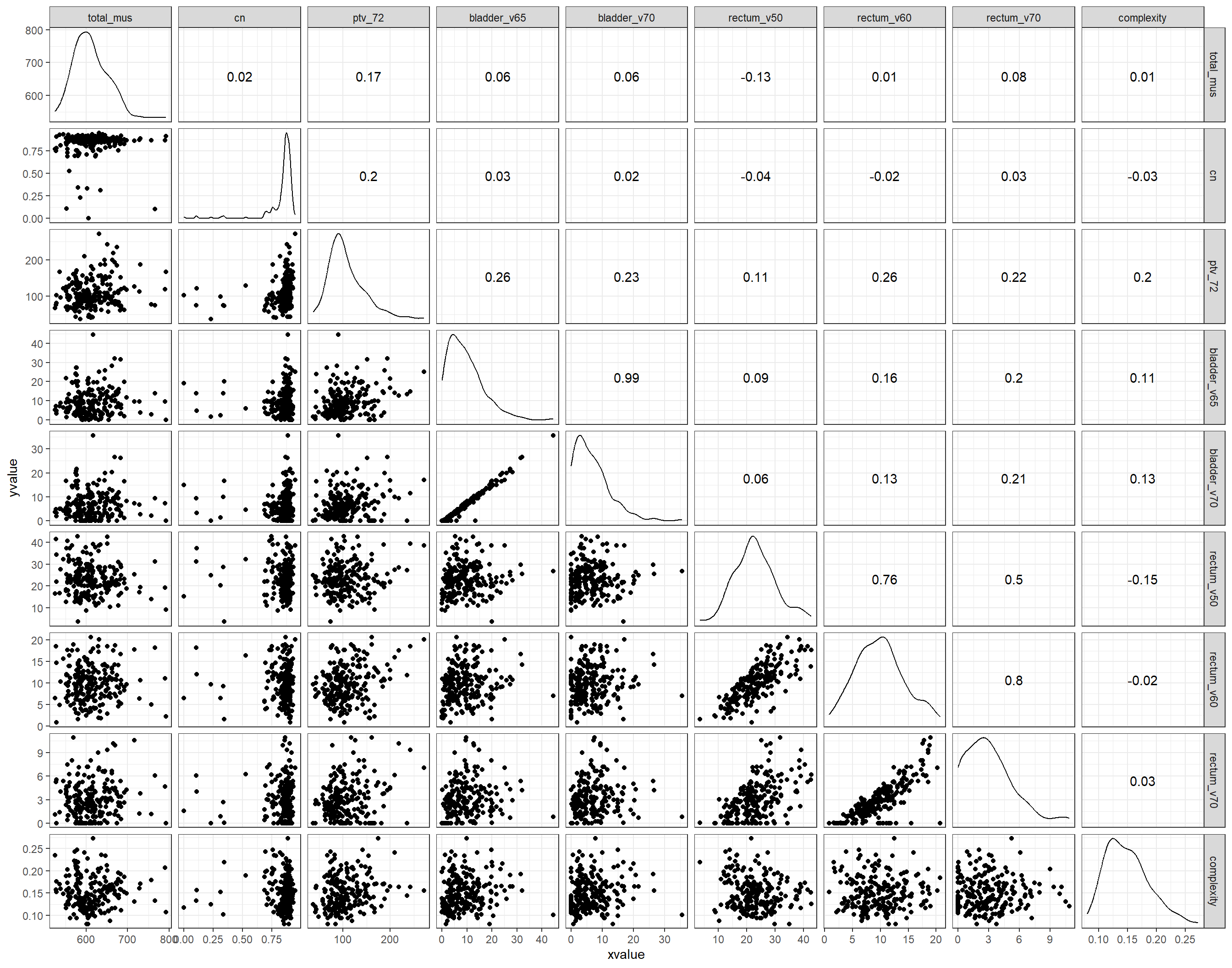
Figure 5.10: Matrix scatter plot of the candidate predictor variables in the initial dataset, along with the respective Pearson’s correlation coefficients.
In the same context, we considered the variance inflation factors. VIFs show how much the variance of the estimated coefficients are inflated compared to the variance when the independent variables are not correlated. Usually, a value less than 4 indicates no multicollinearity. In Table 5.2, we notice that bladder_v65, bladder_v70 have an
exceptionally high VIF value. Also rectum_60 and rectum_v70 have a \(\text{VIF}>4\). Based on the VIF values and the previous correlation plots, we chose to drop bladder_v70 and rectum_v70. These variables frequently assume the value of zero, and therefore we hypothesize that they contain less information than bladder_v65 and rectum_v60, respectively. After removing the collinear variables, we re-ran the VIF analysis to check whether the new VIF values have settled below 4. In Table 5.3, we confirm that after removing the two collinear variables, the rest of the variables, although they exhibit some variance inflation, this is below the cutoff of 4.
| Est. | 2.5% | 97.5% | t val. | p | VIF | |
|---|---|---|---|---|---|---|
| (Intercept) | 0.30 | 0.25 | 0.36 | 11.01 | 0.00 | NA |
| total_mus | 0.00 | 0.00 | 0.00 | -1.64 | 0.10 | 1.35 |
| arcs2 | -0.02 | -0.03 | -0.01 | -4.85 | 0.00 | 2.05 |
| field_sizePSV | -0.03 | -0.03 | -0.02 | -5.39 | 0.00 | 2.31 |
| field_sizeWPRT | -0.05 | -0.06 | -0.04 | -9.48 | 0.00 | 2.31 |
| physicianPhys2 | -0.02 | -0.03 | 0.00 | -2.14 | 0.03 | 2.61 |
| physicianPhys3 | 0.00 | -0.02 | 0.02 | -0.14 | 0.89 | 2.61 |
| physicianPhys4 | -0.01 | -0.04 | 0.01 | -0.91 | 0.36 | 2.61 |
| physicianPhys5 | -0.02 | -0.03 | 0.00 | -1.69 | 0.09 | 2.61 |
| physicianPhys6 | 0.00 | -0.01 | 0.02 | 0.53 | 0.60 | 2.61 |
| physicianPhys7 | -0.02 | -0.03 | 0.00 | -2.27 | 0.02 | 2.61 |
| dosimetristDos2 | 0.01 | 0.00 | 0.01 | 1.65 | 0.10 | 1.40 |
| tps_version15.1.52 | -0.04 | -0.05 | -0.03 | -10.36 | 0.00 | 1.74 |
| cn | -0.02 | -0.05 | 0.00 | -2.08 | 0.04 | 1.15 |
| ptv_72 | 0.00 | 0.00 | 0.00 | 2.46 | 0.01 | 1.41 |
| bladder_v65 | 0.00 | 0.00 | 0.00 | -0.52 | 0.60 | 51.07 |
| bladder_v70 | 0.00 | 0.00 | 0.00 | 0.76 | 0.45 | 52.28 |
| rectum_v50 | 0.00 | 0.00 | 0.00 | -4.28 | 0.00 | 3.66 |
| rectum_v60 | 0.00 | 0.00 | 0.00 | 1.56 | 0.12 | 7.15 |
| rectum_v70 | 0.00 | 0.00 | 0.00 | 0.15 | 0.88 | 4.39 |
| Est. | 2.5% | 97.5% | t val. | p | VIF | |
|---|---|---|---|---|---|---|
| (Intercept) | 0.30 | 0.25 | 0.36 | 11.04 | 0.00 | NA |
| total_mus | 0.00 | 0.00 | 0.00 | -1.64 | 0.10 | 1.35 |
| arcs2 | -0.02 | -0.03 | -0.01 | -4.98 | 0.00 | 1.94 |
| field_sizePSV | -0.03 | -0.04 | -0.02 | -5.61 | 0.00 | 2.09 |
| field_sizeWPRT | -0.05 | -0.06 | -0.04 | -10.07 | 0.00 | 2.09 |
| physicianPhys2 | -0.02 | -0.03 | 0.00 | -2.06 | 0.04 | 2.34 |
| physicianPhys3 | 0.00 | -0.02 | 0.02 | -0.07 | 0.95 | 2.34 |
| physicianPhys4 | -0.01 | -0.03 | 0.01 | -0.80 | 0.43 | 2.34 |
| physicianPhys5 | -0.01 | -0.03 | 0.00 | -1.61 | 0.11 | 2.34 |
| physicianPhys6 | 0.01 | -0.01 | 0.02 | 0.56 | 0.58 | 2.34 |
| physicianPhys7 | -0.02 | -0.03 | 0.00 | -2.23 | 0.03 | 2.34 |
| dosimetristDos2 | 0.01 | 0.00 | 0.01 | 1.60 | 0.11 | 1.37 |
| tps_version15.1.52 | -0.04 | -0.05 | -0.03 | -10.54 | 0.00 | 1.69 |
| cn | -0.02 | -0.05 | 0.00 | -2.11 | 0.04 | 1.15 |
| ptv_72 | 0.00 | 0.00 | 0.00 | 2.35 | 0.02 | 1.37 |
| bladder_v65 | 0.00 | 0.00 | 0.00 | 1.54 | 0.13 | 1.27 |
| rectum_v50 | 0.00 | 0.00 | 0.00 | -4.51 | 0.00 | 3.42 |
| rectum_v60 | 0.00 | 0.00 | 0.00 | 2.56 | 0.01 | 3.06 |
5.4.2 Univariate analysis
After the removal of the collinear variables, we performed a univariate analysis on the rest of the covariates to decide which one of them would be included in the multivariate regression analysis. Any variable with p<0.2 in the univariate analysis was selected for inclusion in multivariate analysis. The results are summarized in Table 8:
| Variable Name | p-value | Inclusion in multivariate model |
|---|---|---|
| total_mus | 0.852 | No |
| arcs | <0.001 | Yes |
| field_size | <0.001 | Yes |
| physician | 0.546 | No |
| dosimetrist | 0.003 | Yes |
| tps_version | <0.001 | Yes |
| cn | 0.616 | No |
| ptv_72 | 0.003 | Yes |
| bladder_v65 | 0.110 | Yes |
| rectum_v50 | 0.031 | Yes |
| rectum_v60 | 0.818 | No |
Fig. 5.11 shows the distribution of LTMCSV against every categorical variable that emerged as statistically significant in the univariate analysis. The difference in complexity is more prominent among plans of different field sizes. An expected result since WPRT contains 3 prescription levels (72 Gy, 57.6 Gy, and 51.2 Gy) and exposes OARs to significantly higher radiation doses, rather than PSV or PO. The differences are less noticeable, albeit present, in the number of arcs and TPS version and even less for the dosimetrist. Similarly, Fig. 5.12 presents plots of LTMCSV vs. the statistically significant continuous variables in the dataset. Regarding dose to the rectum, it appears that as \(V_{50}\) increases, so does the complexity. Presumably, the presence of high doses to the rectum during the optimization process drives the dosimetrist to assign a high weight factor in the \(V_{50}\) plan objective. This, in turn, leads to an increase in the plan’s modulation degree and, therefore, complexity.
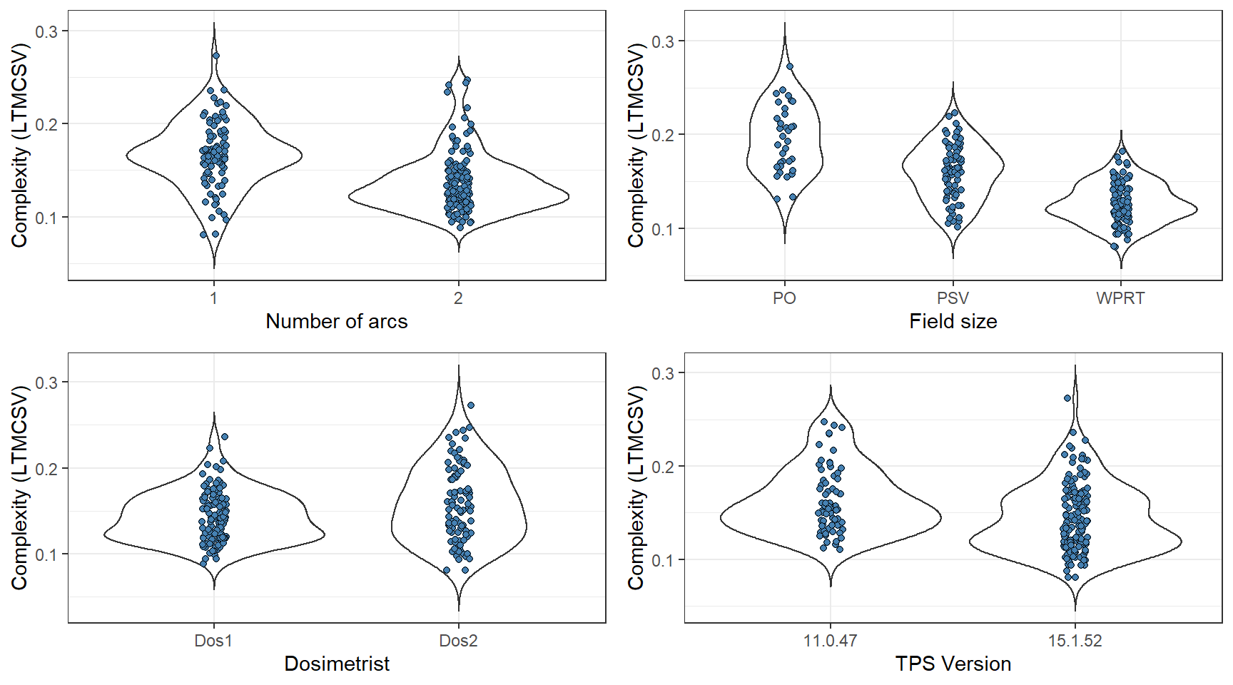
Figure 5.11: Categorical variables that were determined as significant during the univariate analysis. The lower the LTMCSV, the more complex the plan.
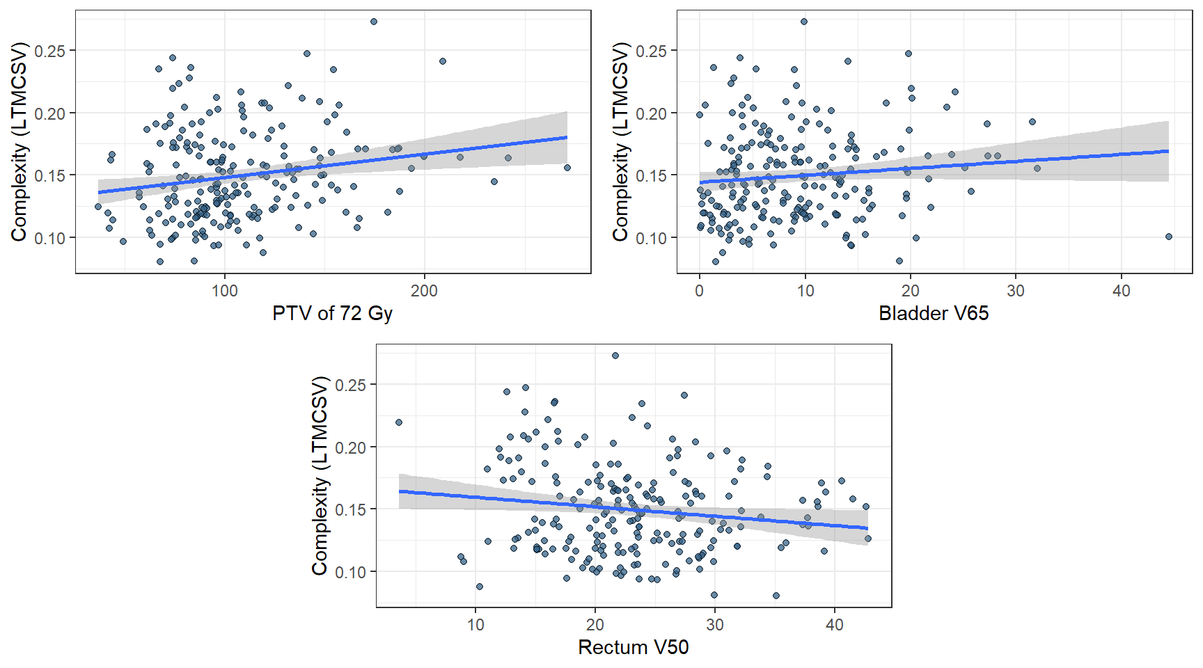
Figure 5.12: Continuous variables that were determined as significant during the univariate analysis. The lower the LTMCSV, the more complex the plan.
5.4.3 Multivariate analysis
5.4.3.1 Reduced model
We ran a multivariate linear model with the seven predictor variables that we selected during the univariate analysis. All variables, except for bladder’s \(V_{65}\), were statistically significant plan complexity predictors. These results are plausible since using two arcs is more common in WPRT plans, which, in turn, are inherently more complicated due to their intricate geometric relations of large treatment volumes and surrounding organs at risk. The treatment planning version effect was also expected because optimization algorithms changed from version 11 to version 15. Finally, PTV 72 Gy and rectum’s \(V_{50}\) are also plausible contributors to complexity as their overlap imposes additional constraints on the plan. The difference between dosimetrists, although statistically significant, is of small magnitude, which can be explained by factoring in the common TPS, the shared plan templates, and cross-pollination of knowledge in our department.
5.4.3.2 Full model
We also ran a full model with all the predictor variables included. In Table ??, both the reduced and the full model are summarized. All variables, except for dosimetrist, retained their statistical significance in the multivariate model. Additionally, there was a statistically significant difference in the physician that contoured the plan, although marginal. Last, both the conformation number and rectum’s \(V_{60}\) dose were significant. A higher conformation number implies greater modulation of dose intensity. By the same token, higher rectum’s \(V_{60}\) doses imply less modulation.
Since the two models were nested, we used R’s anova() function to compare them. The residual sum of squares (RSS) value of the full model (RSS=0.088) was smaller than the one of the reduced model (RSS=0.104). The partial F-test, which compares the RSS of the two models to see if the change in RSS due to the omission of a term is significant, reported p<0.001. Last, the Akaike Information Criterion of the full model (AIC=-1041) was lower in comparison to the reduced model (AIC=-1023). Therefore, we concluded that the full model’s additional variables provided statistically significant extra information in predicting a plan’s complexity when the other explanatory variables have already been considered.
In Fig. 5.13, we show some diagnostic plots for evaluating our model’s validity. In the “Residuals vs. Fitted” plot, the red line is approximately horizontal, lacking any distinct patterns. This is an indication of a linear association. In the “Normal Q-Q” plot, the standardized residuals points follow the straight line, representing the perfect percentile line, implying that residuals are normally distributed. In “Scale-Location”, an approximately horizontal line with equally spread points is a good indication of homoscedasticity. Finally, the “Residuals vs. Leverage” plot is used to detect influential observations. All things considered, there were no major violations of the underlying assumptions for the linear model (linearity of relationship, normality in the residuals, and equality of variances.)
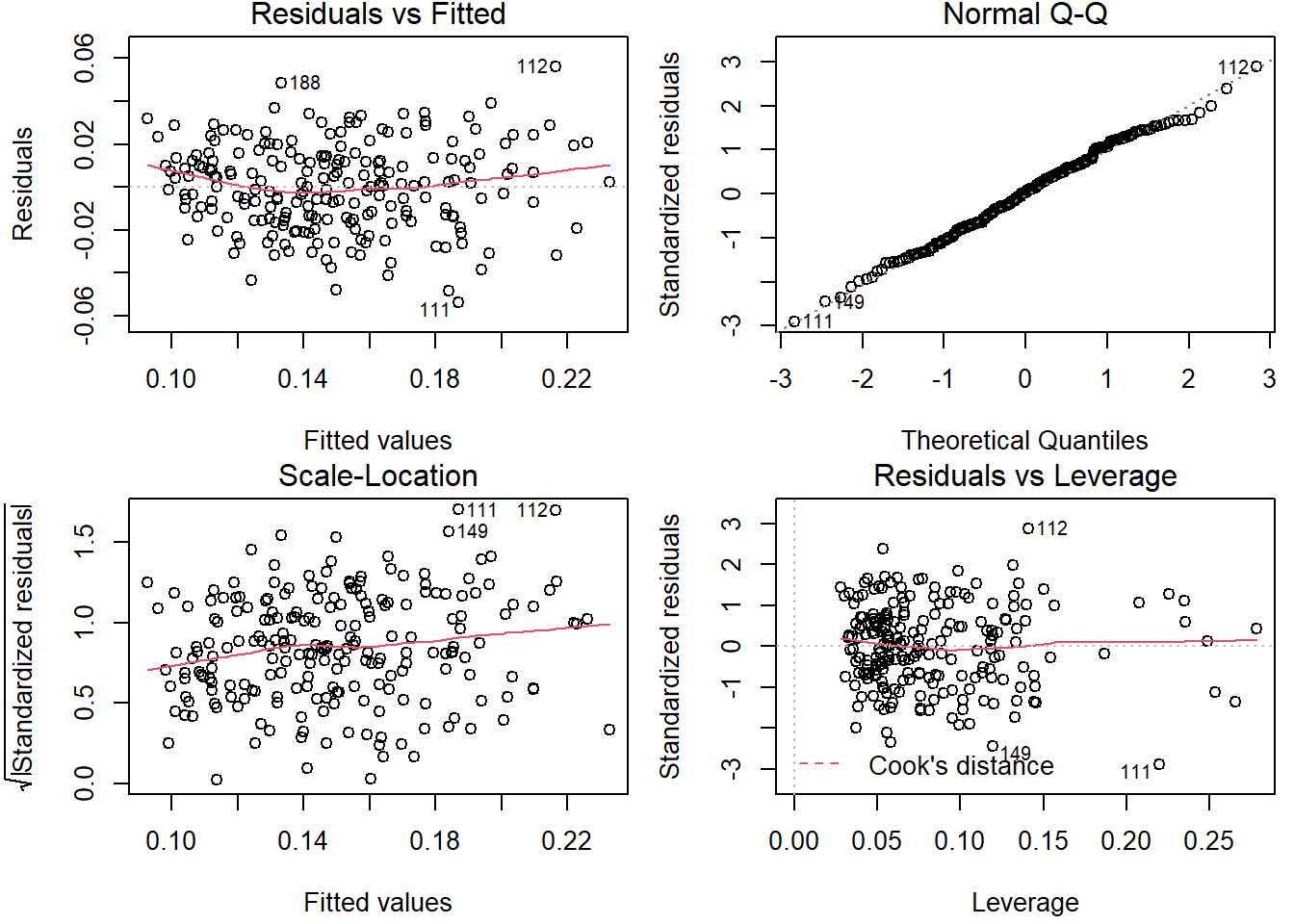
Figure 5.13: Diagnostic plots of the full linear model.
In Fig. 5.14 we plotted the real complexity vs. the predicted complexity for the two models (reduced and full). We notice how the two models perform reasonably well. The full model’s adjusted \(R^2\) was 0.671 and reduced model’s adjusted \(R^2\) was 0.627.
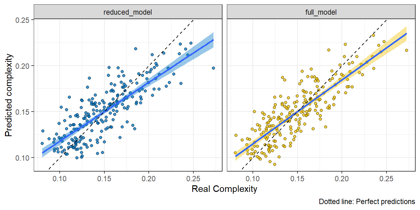
Figure 5.14: Real complexity vs. predicted complexity for the reduced and full model. The dotted line represents perfect predictions.
5.4.3.3 Backward and forward search
We used backward and forward selection to pick the best predictor variables. Although this is usually not the case, both backward and forward selection methods converged on the same set of predictor variables, which included all covariates.
5.5 Logistic Regression analysis
Instead of predicting the exact value of complexity, we considered grouping VMAT plans into high complexity and low complexity plans. Ideally, the cutoff value should be chosen based on an analysis of complexity vs. deliverability. However, since this was beyond the thesis’s scope, we arbitrarily defined as high complexity plans whose complexity exceeded the dataset’s median value (Fig. 5.15). We keep in mind that LTMCSV increases as plan complexity decreases. Therefore, plans with an LTMCSV value larger than the dataset’s median value were designated as “low complexity plans”.
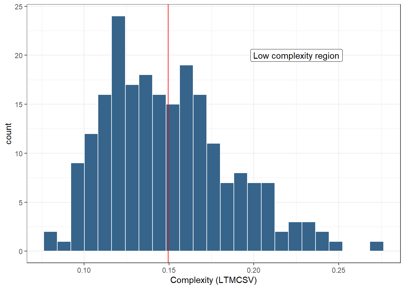
Figure 5.15: Histogram distribution of complexity (LTMCSV). The vertical red line represents the median complexity, which was used as a cut-off value separating high-complexity plans from low-complexity ones. LTMCSV increases as complexity decreases, therefore the area to the right of the red line corresponds to low complexity plans.
The following plots in Fig. 5.16 were generated with glmnet during the process of solving the logistic regression problem with LASSO regularization. The first figure shows binomial deviance as a function of the regularization parameter \(\lambda\). The optimal value of \(\lambda\) was chosen that minimized the 5-fold cross-validated binomial deviance (\(\lambda_{\text{opt}}=0.0251\)). The second plot shows the model’s coefficients’ values for increasing values of the regularization parameter \(\lambda\). It is evident that as \(\lambda\) grows, LASSO is invoking sparsity to the model by forcing some of the coefficients to become zero, as opposed to ridge regression (Table 5.4). In the limit where \(\lambda\) grows large, all the coefficients of the model become zero. This is a well-known property of LASSO, and it is used as a feature selection process. The last figure shows percent of deviance vs. coefficients. Toward the end of the path, the explained deviance values are not changing much, but the coefficients start to “blow up”. This information can be used to identify the parts of the fit that matter.
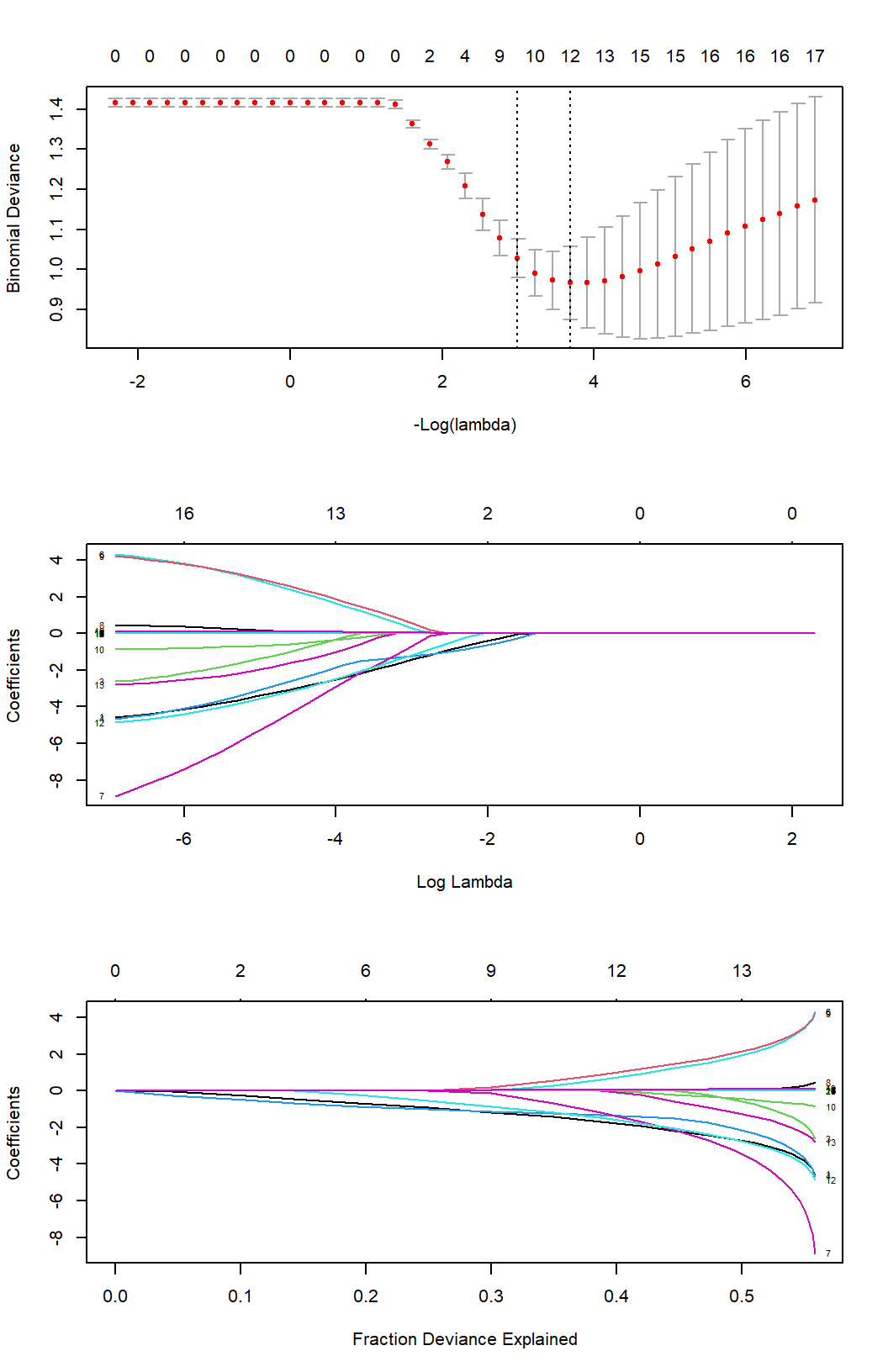
Figure 5.16: Binomial deviance and model coefficients along the regularization path. LASSO regression invokes sparsity by driving certain coefficients to zero, as the value of \(\lambda\) increases, performing essentially feature selection.
After having trained our logistic regression model on the training set, we evaluated its performance with confusion matrices (Fig. 5.17). The value of “1” corresponds to the class label “low complexity plan”, and the value of “0” corresponds to the class label “high complexity plan”. The accuracy of the model was 87.25%, and the AUC 0.906 (Fig. 5.18). Of particular interest is the false positive rate (FP). I.e., plans classified as “low complexity”, whereas their correct class was “high complexity”. The FP rate in the train set was 14.6%, and in the test set, 14.8%. Since FP is of greater importance than FN, one could tune the model to exhibit larger specificity at the cost of lower sensitivity.
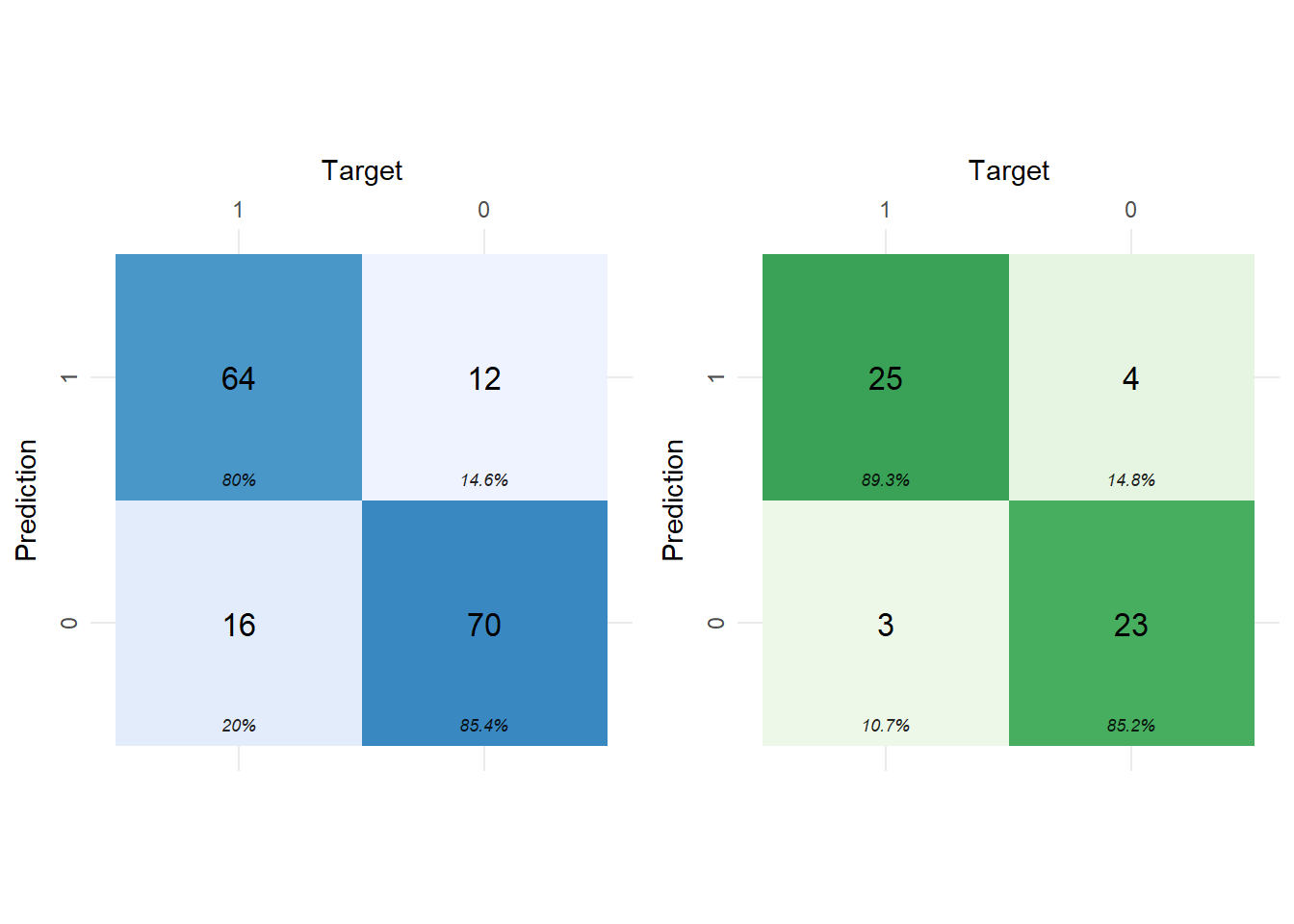
Figure 5.17: Confusion matrices of the best LASSO logistic regression model for the training set (left) and for the test set (right). Class 1 corresponds to low-complexity plans, and Class 0 to high-complexity plans.
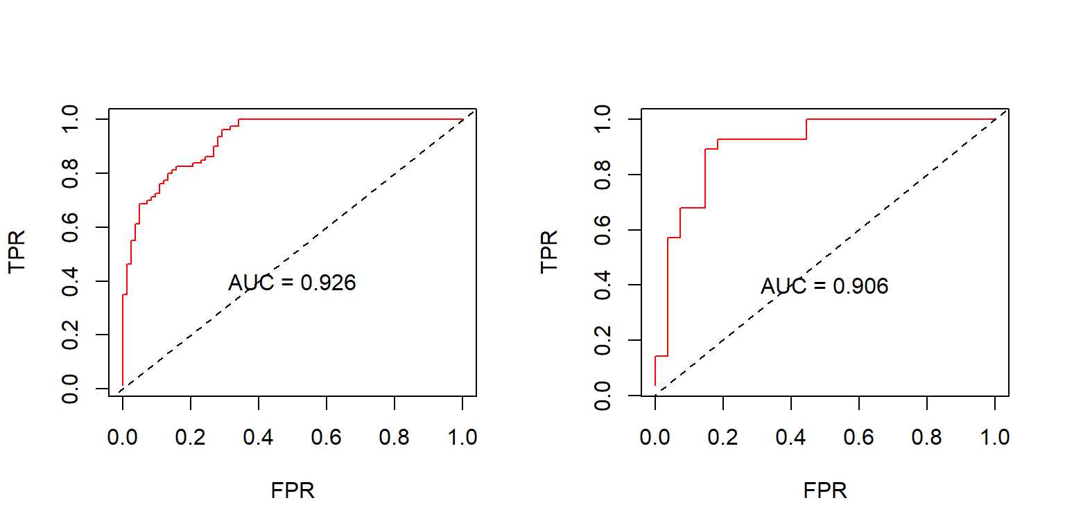
Figure 5.18: ROC evaluated in the training set (left) and in the test set (right). The dashed lines represent a random classifier. AUC: Area Under Curve, TPR: True Positive Rate, FPR: False Positive Rate.
| term | step | estimate | lambda | dev.ratio |
|---|---|---|---|---|
| (Intercept) | 1 | 2.779 | 0.025 | 0.446 |
| arcs2 | 1 | -2.181 | 0.025 | 0.446 |
| field_sizeWPRT | 1 | -1.490 | 0.025 | 0.446 |
| physicianPhys3 | 1 | 1.243 | 0.025 | 0.446 |
| physicianPhys4 | 1 | -2.123 | 0.025 | 0.446 |
| physicianPhys6 | 1 | 1.483 | 0.025 | 0.446 |
| physicianPhys7 | 1 | -0.198 | 0.025 | 0.446 |
| dosimetristDos2 | 1 | 0.073 | 0.025 | 0.446 |
| tps_version15.1.52 | 1 | -2.067 | 0.025 | 0.446 |
| cn | 1 | -0.584 | 0.025 | 0.446 |
| ptv_72 | 1 | 0.006 | 0.025 | 0.446 |
| bladder_v70 | 1 | 0.032 | 0.025 | 0.446 |
| rectum_v70 | 1 | 0.075 | 0.025 | 0.446 |